
Mac App Store optimization: the definitive guide
No Apple Ads, no A/B tests, and no custom product pages? Here’s how Mac App Store optimization actually works, and what replaces the missing iOS toolkit.
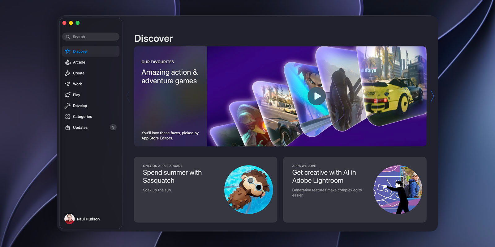
Let’s get the bad news out of the way first: the Mac App Store has no Apple Ads, no product page optimization, no custom product pages, and no in-app events – those are each powerful tools, but all of them are available only for iOS and iPadOS.
I know that might sound bad, but it’s also true that the Mac App Store is much, much smaller than the iOS App Store, which means a little optimization work can go a long way.
This guide covers what actually works in place of the missing tools – keywords, screenshots, featuring, pricing, and the open web – plus everything else that’s different from iOS. (For future readers: This guide is current as of July 2026, because this stuff changes constantly.)
Jump to what you need
If you want to skip ahead to a particular section, here you go:
- How the Mac App Store is different
- Keywords: the same fields, a fraction of the competition
- Categories and the sidebar
- Screenshots and your product page
- Featuring: the lever that actually moves
- Pricing, ratings, and reviews
- Marketing beyond the store
How the Mac App Store is different
Before we optimize anything, take a look at the overall story: the Mac App Store giveth and it taketh away.
What it can give you is lower competition in particular searches. Please do try it for yourself: open the Mac App Store, search for one of your app’s core keywords, then count the serious results and inspect their metadata and update history. Some lists are still fiercely competitive, but many others are much thinner or even nonexistent.
What it taketh away is most of the iOS growth toolkit. As of mid-2026:
- No Apple Ads. Apple’s ad platform runs on the iPhone and iPad App Store (plus News, Stocks, and Maps) – there is no way to buy search placement on the Mac App Store, and no keyword bid data to mine for research either.
- No product page optimization. Apple’s built-in A/B testing is iOS and iPadOS only, so there’s no native way to split-test your Mac screenshots.
- No custom product pages. Those 70 targeted page variants iOS developers get? Not for you, Mac developers.
- No in-app events. These little event cards give iOS apps extra search and editorial surface, and so are hugely popular. Sadly, they just don’t exist on the Mac App Store.
So the search results might be easier to climb, but the tools available for climbing are fewer: your app’s metadata, your screenshots, your user reviews, and – if you’re lucky – being featured by App Store editorial.
There are two more Mac-only realities that ought to shape your strategy.
First, the Mac App Store requires your app to be sandboxed, so apps needing deep system access can’t be there at all, which removes entire categories of competitors.
Second, unlike iOS, the Mac App Store is optional: you can notarize and sell directly from your website too, and plenty of developers do both. Winning inside the store is most of this guide, but life outside it is such a big part of Mac marketing that it gets its own section below.
Keywords: the same fields, a fraction of the competition
The basics of App Store optimization are the same on both macOS and iOS, meaning that App Store Connect gives your Mac app the visibility fields you’re already used to: a 30-character name, a 30-character subtitle, and a 100-character hidden keyword field.
Similarly, all of Apple’s review guidelines haven’t changed, so the name and subtitle must accurately describe the app and rule out product claims you can’t back up – things like “TaskFlow: Plan Your Week” earn trust, whereas “TaskFlow: Planner Todo Focus” is more like metadata in a trenchcoat.
The first difference is the payoff curve. On iOS, trying to rank for a broad keyword like “notes” is absurdly hard for an indie to achieve, but on the Mac it’s merely difficult, and the long tail is often nonexistent – there are meaningful, purchase-intent searches on the Mac App Store with three or four serious results.
So, when you do your research, don’t discard broad keywords as being automatically hopeless the way you would on iOS; check them on macOS, because sometimes the incumbents’ metadata is so lazy you can pretty much walk right in.
The second difference matters enormously if your app is sold as a universal purchase across iOS and macOS: your app name and subtitle are shared across every platform, because they live in a shared App Information screen rather than on a single platform’s version page.
In comparison, your keyword field, description, promotional text, and screenshots are all per-platform, so your Mac version has its own 100 characters of keywords.
This means the name and subtitle you carefully optimized for iPhone searches are also the ones Mac users see. So, if if macOS is a serious platform for you those 60 characters need to earn their keep in both stores, and that usually means favoring the plain, obvious words that work everywhere over cute iOS-specific phrasing.
The third difference is the extreme lack of data available. Because Apple Ads doesn’t run on the Mac, the search popularity numbers every iOS keyword tool leans on simply don’t exist for Mac searches.
What we can measure is rankings: Apple’s public search API distinguishes Mac software from iOS software, so tracking where you and your competitors rank per keyword, per region, works fine. Appfigures and Astro have Mac support, and my own Kickstart app tracks keyword rankings separately for iOS, iPadOS, and macOS precisely because the three lists differ so much.
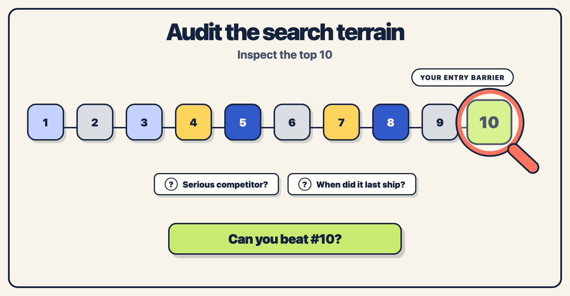
In Kickstart I gave each keyword a difficulty rating and an entry barrier rating that shows how popular the #10 ranked app is, because if you can beat that you at least have some kind of firm foothold. But it’s with macOS keywords that the entry barrier results become exciting, because all too often result #10 is an app that hasn’t been updated since Catalina – that’s 2019, in case you’ve lost track.
So, pick out three core keywords, search each one in the Mac App Store, write down who holds positions 1 to 10, and also write down when they last shipped an update. On iOS that exercise is usually sobering, but on the Mac it’s often motivating instead – you will be astonished how easy some categories are to rank in.
Categories and the sidebar
On iOS, category charts mostly stopped mattering for discovery some years ago, because very few people browse to Productivity and just scroll to see what they can find.
The Mac App Store is different thanks to a simple piece of UI: the persistent sidebar. Categories for Discover, Create, Work, Play, and Develop sit permanently along the left of the store, each one sending you to a curated storefront. This lets Mac users browse in a way iPhone users don’t – their store is a windowed app you can leave open, not a small phone screen you flick past.
All this makes your category choice a meaningful decision rather than a mere formality:
- Pick the category where you can have a shot of cracking the top 10, not the one that describes you most flatteringly – a utility ranked #8 in Utilities beats the same app ranked #30 in Productivity.
- Check the charts before you commit to your primary category – who holds #10 in each candidate category, how established are they, and how long ago did they last put out an app update? (Note: Rating counts add context, but they are not a reliable download estimate.)
- Providing a secondary category costs you nothing, so use it.
In short: pick the room that’s easiest to win, verify what the entry barrier looks like, and take the free second listing. (And remember those sidebar categories when you think about editorial nominations, because Create, Work, Play, and Develop are all editorial real estate someone has to fill every week from a small pool of Mac apps.)
Screenshots and your product page
Mac screenshots have their own rules, starting with shape: they’re 16:10 landscape, accepted at 1280×800, 1440×900, 2560×1600, or 2880×1800. I suggest you upload at 2880×1800, only because it’s the sharpest option.
Apple accepts one to ten screenshots, but realistically you always need at least three so you can show 1) the core job, 2) a second useful workflow, and 3) the depth behind both.
Now the part that changes your design: your first screenshot appears nice and big in search results, with the rest hidden away after the user clicks through for more. This means your first screenshot isn’t decoration on your product page – it’s your whole storefront window in every search you rank for.
So, the tried and tested rule from iOS applies with extra force here: plain screenshots just don’t cut it. Your first image needs a short benefit caption in genuinely huge type – way bigger than you would naturally use – with your app shown doing whatever is its most impressive thing.
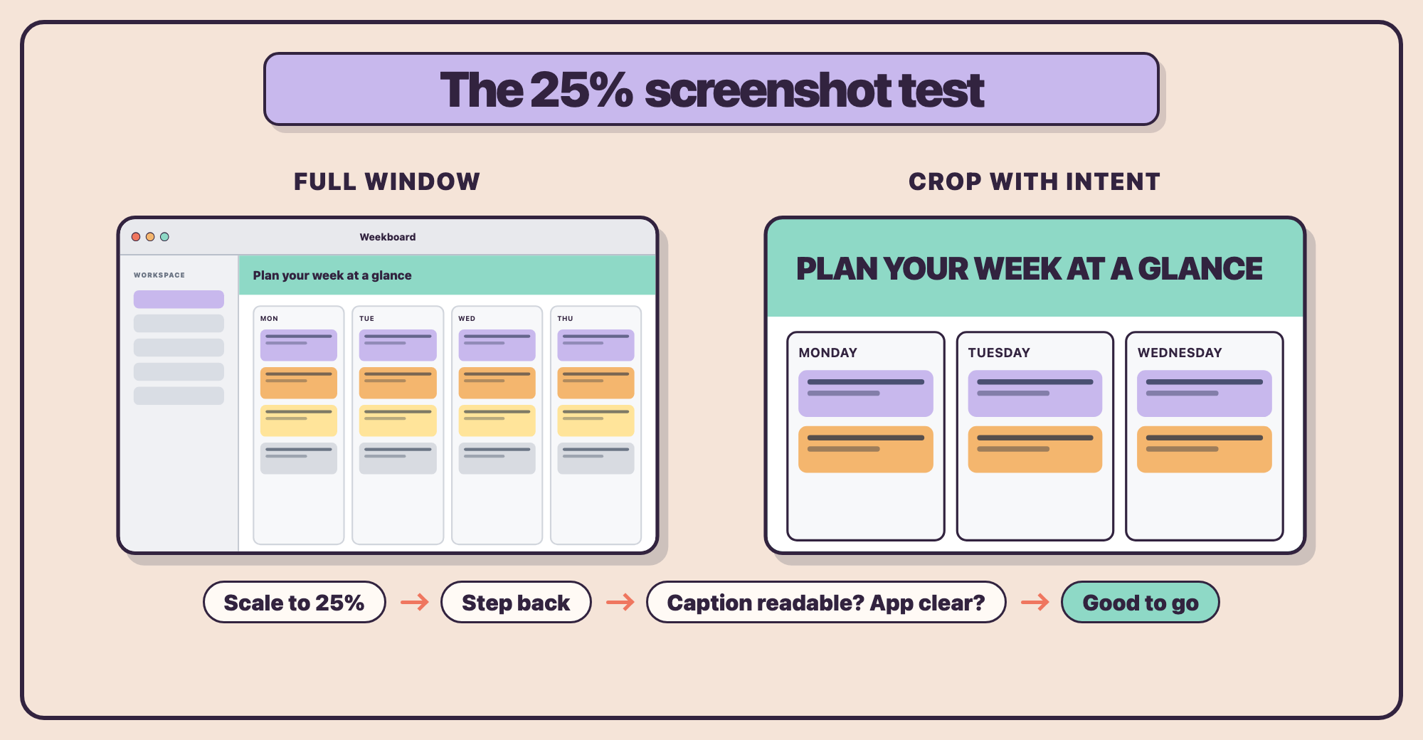
A full Mac window at 2880×1800 shrinks brutally in the results list, and things like window chrome, sidebars, and toolbars shrink with it. So, it’s okay to crop with intent rather than struggling to frame the entire window every time.
My test here is straightforward: export your draft screenshot, open it in the Preview app or similar, scale it down to about 25% zoom, then step back a little from your screen and see what you think – if you can’t clearly read the caption and see what the app does, you should probably crop it.
There are a few other Mac-specific screenshot tips you should be aware of:
- Show real Mac UI such as native toolbars, sidebars, menus. Mac users are often pickier than iOS users when it comes to apps that look like they’ve been ported from web pages, and they’re making that judgement solely from your screenshots.
- Dark mode screenshots look great in the results list, but pick one appearance and stick with it – mixing light and dark appearances across your screenshots can look accidental.
- You can add app previews, if they help. The bar for a good app preview video is high and screwing it up will actively cost you downloads, so always focus on screenshots first.
- Believe it or not, just having a modern macOS wallpaper or system UI visible helps – you can see find a ton of app screenshots featuring wallpapers from El Capitan or Yosemite, which immediately make them feel old and unloved.
Annoyingly, the lack of product page optimization on the Mac means you can’t A/B test any of this natively – your options are judgement, the 25% test above, and watching your conversion rate in App Store Connect analytics before and after a screenshot change. This is far cruder than iOS testing where we have Apple’s analytics to hand, but a real bad-to-good first screenshot swing won’t be subtle!
Featuring: the lever that actually moves
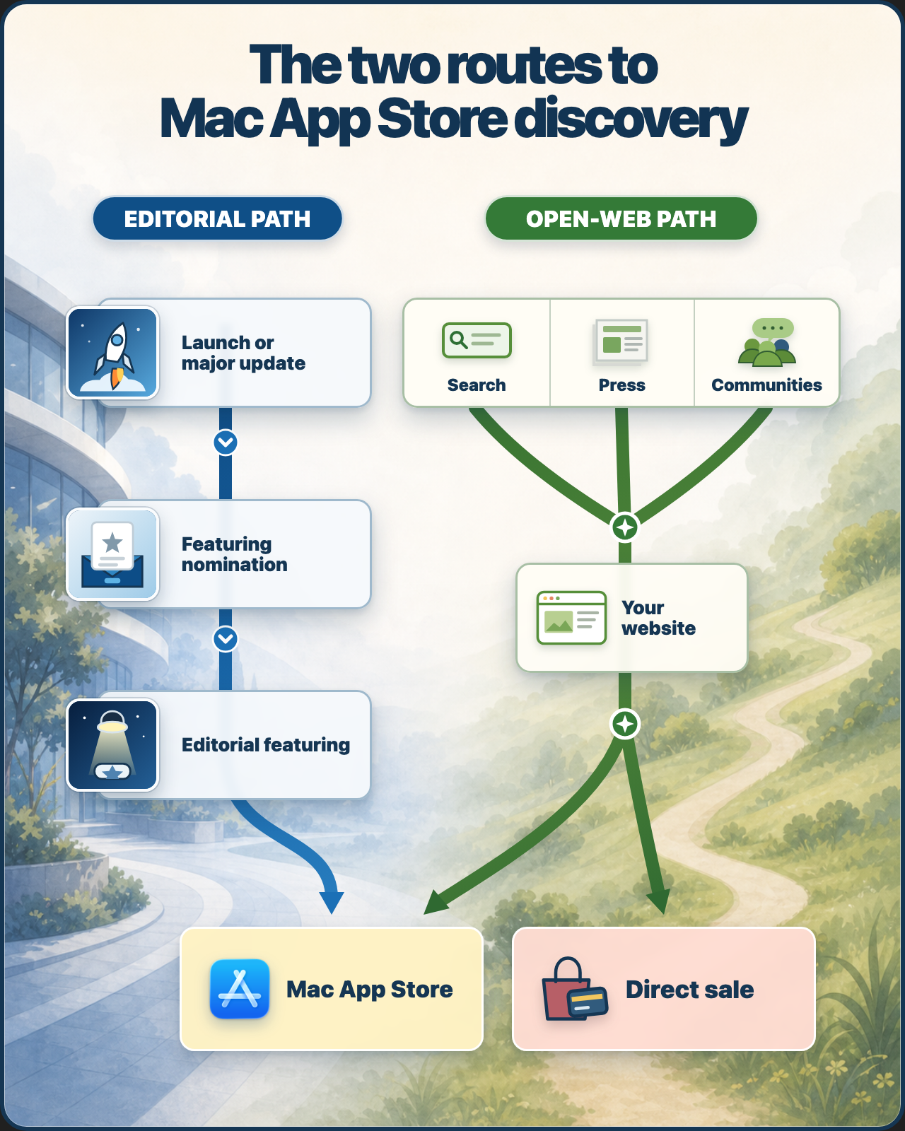
Being featured by Apple can put a Mac app in front of millions of customers without any sort of ad platform needed, making it one of the few discovery events worth planning for. I won’t pretend to know your odds of success, because Apple doesn’t publish acceptance rates by platform.
But I can say two things for sure:
- You don’t have to wait to be noticed, because since 2023 you can ask directly using App Store Connect’s Featuring Nominations form. A nomination includes what the moment is (a launch, a major update, or new content), your launch window, the platforms and regions it applies to, a description of up to 1,000 characters, and optional supplemental materials.
- Mac App Store editorial runs directly from Cupertino, rather than being spread out across the world in the same way as iOS editorial. This makes it harder to get noticed, and also harder for your local Apple developer contact to help recommend your app for featuring.
With that in mind, here’s how to make a nomination that gets read:
- Nominate moments, not existence. “Version 4.0 adds full offline sync” is a real story an editor can use, whereas “please feature my app update” is not.
- Yes, you should always include the exact version in there – don’t leave the editorial team guessing which update is attached to which nomination request.
- Lead your description with what’s new and why Mac users specifically will care. Editors feature apps that make the platform look good.
- Adopt Apple’s current technologies visibly. Every year their featuring cycle closely track whatever was shipped at WWDC – Siri AI integration, new Foundation Models features, etc – because editorial exists partly to showcase the platform. You aren’t selling out by meeting them halfway, you’re just speaking their language.
- File your nomination request at least four weeks before your release, then file one for every significant release in the future. Seriously, there is no penalty at all for nominating yourself and not getting picked, so make this a standing item on your release checklist. (Also, not picking you now doesn’t mean they will ignore you forever – at least you’re on their radar now!)
As for me, I find this area uncomfortable to write about with much confidence, because featuring is one part of ASO where the decision is made by humans – anyone who tells you they have featuring figured out is extrapolating from a sample size of themselves. But the mechanics above are free, they take maybe an hour per release, and the downside is zero, so you have nothing to lose.
Pricing, ratings, and reviews
Mac pricing can be surprisingly simple, and you’ll find that paid-up-front apps at $20, $30, and beyond are easy enough to find. That doesn’t mean your app should charge the same, though – build a dated comparison of direct competitors with the same audience, business model, and update policy, then run the coffee test with those numbers beside it.
Paid-up-front apps don’t get free trials, on Mac or anywhere else on the App Store. So, the standard pattern is a free download with an in-app purchase or subscription unlocking the full app, and with subscriptions you can offer proper free trials through introductory offers.
Your app’s ratings need some extra care too. App Store Connect lets you inspect them by platform and country or region (as do tools like Kickstart and Helm), so don’t assume an established iOS rating means the Mac page has the same proof.
This matters more than it might sound, because Mac apps accumulate user ratings more slowly compared to iOS apps – there’s a smaller audience, so there are fewer review prompts being shown, and so there are fewer reviews and ratings being sent in. Think about it: if your lifetime total is 40 ratings rather than 4000, every rating significantly moves your overall average – and in both directions.
So:
- Ask for ratings in your Mac app.
requestReviewworks on macOS exactly as on iOS, and I’ve written a full guide for when you should request reviews. - Reply to every review that comes in, especially the negative ones. On a page with 12 reviews, your thoughtful reply under the angriest one might end up being the most-read text on the page.
- Treat your first 20 user ratings as a key task for your launch, not something that just happens to you over time. Ask your TestFlight users and mailing list directly once they’ve had time to genuinely use the app.
If you put all that together, it should be clear that review management for Mac apps is a lever you can actually pull – it’s a real thing you have control over, that can positively boost your sales without a great deal of extra effort.
Marketing beyond the store
iOS developers treat the App Store as a place where marketing happens, backed by ads, events, page tests, and more. But on the Mac, the store is where marketing ends – the discovery part mostly needs to happen on the open web, which is where the missing toolkit’s budget should go instead.
The big take away here is that your website does the job Apple Ads won’t.
Mac buyers use Google. Someone who wants a screenshot tool for their Mac searches the web at least as often as the Mac App Store, and the winner of that search is a page Apple has no say over: your features, your screenshots, your price, your download button.
A simple website that ranks well for “[your category] app for Mac” becomes a permanent, free advert for you and your app, so on the Mac this kind of thing stops being optional and starts being a storefront where users discover you.
I also want to add that press and newsletters still move Mac downloads. The Mac has something iOS lost years ago, which is an enthusiast press that reviews apps, plus newsletters and YouTube channels built around Mac workflows. My favorite Apple blog is MacStories – it’s literally stories about the Mac, and great apps that exist there.
A solid press kit backed up by a short, honest email pitch go much further here than they ever will on the iPhone, simply because there are fewer app releases competing for coverage.
 Tap for full-size (opens in a new tab)
It’s also true that communities compound – Mac users ask each other what to buy, in forums, subreddits, and Mastodon threads where “what’s a good X for the Mac?” gets asked weekly. It’s important that you show up as a helpful developer a long time before you show up as a vendor, and (where appropriate) build in public where Apple folks actually hang out.
And again, remember that the Mac App Store is optional – if you prefer you can notarize and sell directly using your site, with your license keys and your margin, or put a version on Setapp and let its subscribers discover you.
Both are real businesses for plenty of Mac developers, both can coexist with your regular App Store sales, and both deserve the same careful arithmetic as everything else covered in this guide. Direct sales mean you’re responsible for payments, updates, and refunds, but you get back the 15%/30% Apple would otherwise charges. Similarly, Setapp trades revenue share for discovery – you gain their largest audience and marketing push, but they take a slice of your income.
Stop reading, start doing
- Try searching for three core keywords in the Mac App Store – take note of which apps hold the top 10 positions, and also when each of them last shipped an update.
- Open your app’s App Store Connect entry and check through its metadata: are the name and subtitle fields using most of the available 30 characters, and is the Mac keyword field as close to 100 as you can make it?
- Run the 25% test on your first screenshot. If it fails the test because it’s hard to read or understand, rebuild it with a cropped view and an even clearer caption.
- File an editorial nomination for your next release however far away it might be, then and add “file nomination” to your release checklist so it’s something you come back to again and again.
Yes, the Mac App Store might be a quieter corner of Apple’s ecosystem today, but quiet corners won’t stay quiet forever – if you’re shipping your app there, apply the rules in this guide to get ahead of the game and cement your place!