
10 App Store optimization mistakes you can fix in an afternoon
Find and fix ten common App Store listing mistakes: unclear metadata, duplicate keywords, benefit-free screenshots, weak release notes, and untested assumptions.

Most App Store optimization problems aren’t hard to fix, with weak keywords, wasted metadata, poor screenshots, ignored reviews, and untested assumptions all hurting your App Store listing and reducing downloads. So, open App Store Connect in another tab and see how many of these ten ASO mistakes you can eliminate today…
1. Your name field stops at your brand name
Apple gives you 30 characters in the app name field, and it’s the most heavily weighted search text you have. If your entry just says “Flowmodoro” you’re leaving 20 characters of prime ranking space empty – the store can’t rank you for “focus timer” if those words appear nowhere.
The quick check: Ask whether the name tells a new customer what the product is. “Flowmodoro: Focus Timer” is a natural, accurate example; “Flowmodoro: Timer Focus Tasks” is keyword stuffing in a trench coat. Apple’s review guidelines require accurate metadata and rule out irrelevant terms, trademarks, pricing, and claims you can’t back up. Use the space when it helps people as well as search.
2. Your subtitle repeats what the name already said
The subtitle is another 30 characters of indexed text, and the second-strongest ranking signal after your name. The classic waste is repeating your brand or restating the name in different words – “Flowmodoro: Focus Timer” with the subtitle “The best focus timer” burns all 30 characters on words Apple already indexed, plus “the” and “best”, which rank for nothing.
The quick check: Give the subtitle a different job from the name while keeping it readable. If the name is “Flowmodoro: Focus Timer,” a subtitle such as “Plan calm, timed work sessions” adds context and useful terms without looking like a bag of keywords tipped onto the page. (Although given how small these are shown on the screen, keyword stuffing is fine here too!)
3. The same keywords repeated across every field
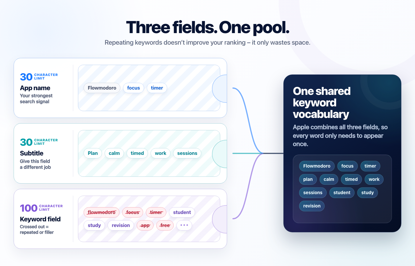
Apple combines your name, subtitle, and keyword field into one pool and only needs each word once – repeating “focus” in all three doesn’t rank you three times as hard, it just wastes two slots another keyword could have used. I see this constantly, because repetition feels like emphasis. It isn’t.
The 10-minute fix: List every word from all three fields and delete the duplicates. You can eyeball this in a text editor in minutes; keyword tools like Appfigures or Astro will flag duplicates too, and Kickstart’s keyword research shows you exactly this. Every slot you free is a new term you can rank for.
One proviso: Custom product pages can only be attached to keywords, so if you put all your best words into your App Store title or subtitle, you might find CPPs harder to use.
4. A keyword field full of wasted characters
The 100-character search keywords field is invisible to users, and it has its own rules: single words separated by commas with no spaces, because Apple builds multi-word phrases for you automatically. Common ways to squander it: whole phrases (“focus timer for students”), spaces after commas, the word “app”, “free”, your own brand name, and your category name – Apple already knows you’re in Productivity.
The 10-minute fix: Rewrite the field as comma-separated single words, no spaces, no filler, then spend the reclaimed characters on long-tail words you can actually own. There’s a lot more nuance to choosing them, but the cleanup alone is pure profit.
5. A benefit-free first screenshot
Your first screenshot does more selling than everything else on your page combined, and the classic mistake is making it a plain, uncaptioned screenshot of your UI. At search-result size your interface text is an unreadable blur, so a raw screenshot communicates precisely nothing – people don’t care what your app looks like until they care what it does for them.
The quick check: Frame your best screen in a device (Kickstart’s free Overdrive feature can capture your Simulator screen already framed, and Charlie Chapman’s Framous is a lovely focused alternative for images you already have) and put one truthful benefit above it in type that remains readable at actual App Store search-result size. Don’t trust a fixed point size across different source canvases: export it, shrink it to the size customers see, and check it with your own eyes. ASO vendors report screenshot-text indexing, but Apple does not document it, so write the caption to persuade a person first.
6. Your best content is buried at screenshot four
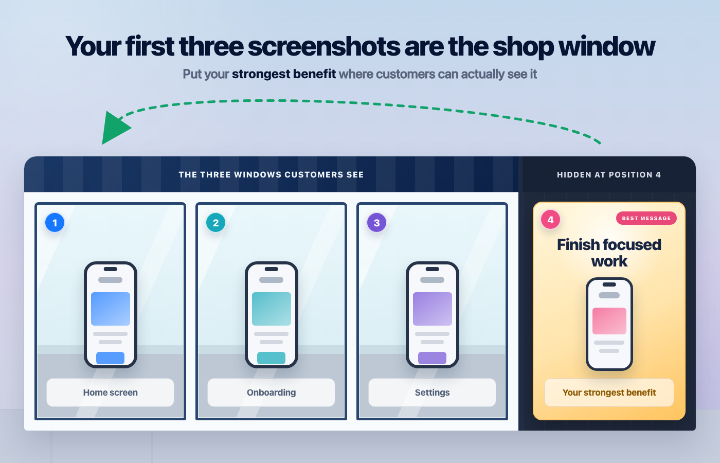
When your app shows up in search results, people see your first three portrait screenshots and make the call right there – most never tap through to your product page at all. So many developers order screenshots like a feature tour: onboarding first, settings somewhere in the middle, and the genuinely impressive thing at position four, where the people who most needed convincing will never see it.
The 10-minute fix: Reorder so your three strongest screenshots – biggest claim, best social proof, most impressive screen – come first. It’s drag and drop in App Store Connect, and it’s the single highest-leverage ten minutes on this list.
7. A What’s New that says “bug fixes and improvements”
Your What’s New text shows on your product page, where some prospective downloaders read it as a freshness signal. “Bug fixes and performance improvements”, unchanged for six versions, basically says “nobody’s home”, but it also tells your existing users that their bug report went into the void.
The 10-minute fix: Write two or three real sentences per release, leading with the change users asked for most. You don’t need to be funny – you need to be specific: “Fixed the timer resetting when you switched apps” earns more trust than any pun. If a release genuinely is just fixes, say which ones.
8. No review prompt strategy at all
Ratings matter for conversion, yet so many apps either never call requestReview() or (worse!) fire it at first launch, when the user has done nothing and feels nothing – a practice Apple is clamping down on hard.
The system displays the prompt at most 3 times per 365 days, but calling the API does not guarantee a display and people can disable prompts entirely.
The 10-minute fix: Find your app’s happy moment – workout logged, invoice sent, level cleared – and call requestReview() there, after the user has succeeded at least a couple of times. One well-placed call will always beat any elaborate scheme.
9. Reviews with no replies
 Tap for full-size (opens in a new tab)
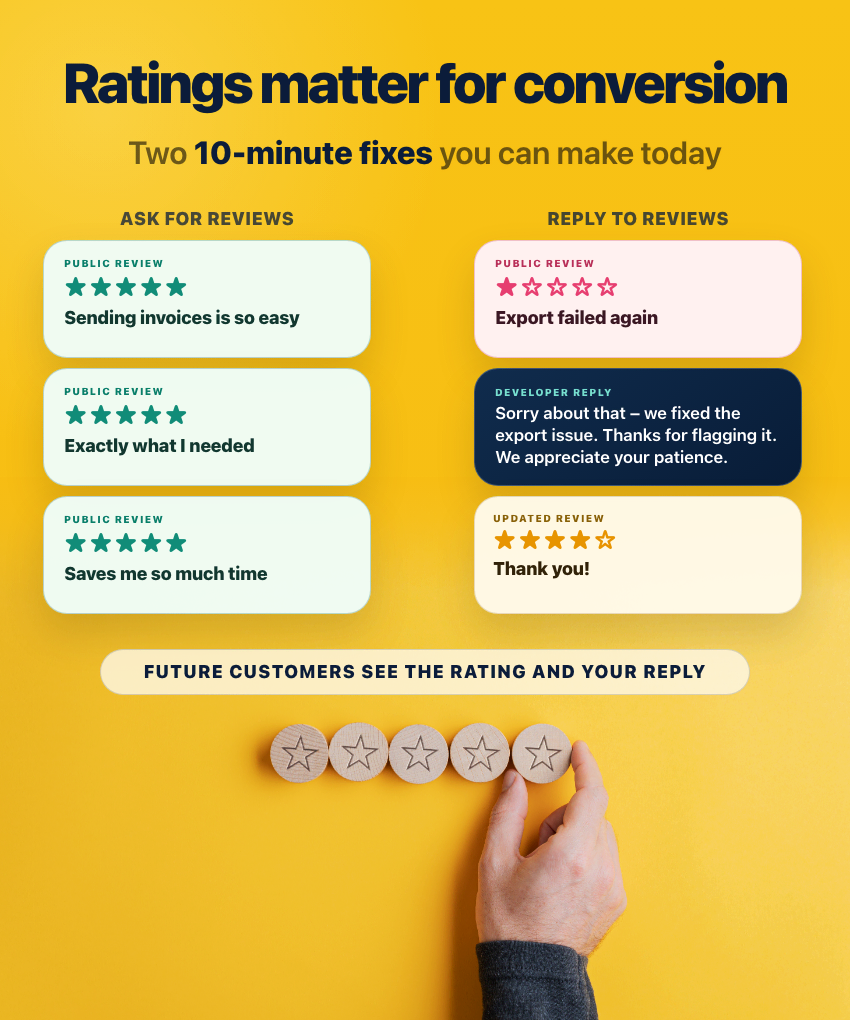
Your replies to reviews are public, and they’re read by far more people than the one reviewer – a page of unanswered one-star complaints tells every prospective downloader that problems here go unfixed. Better still, the reviewer gets notified of your reply and can update their rating, which makes a thoughtful reply to a fixable complaint one of the cheapest rating improvements available.
The 10-minute fix: Open your most recent one- and two-star reviews and reply to three of them today – apologize where it’s deserved, and say what you fixed. Ten minutes a week keeps it that way.
10. You’ve never tested a thing
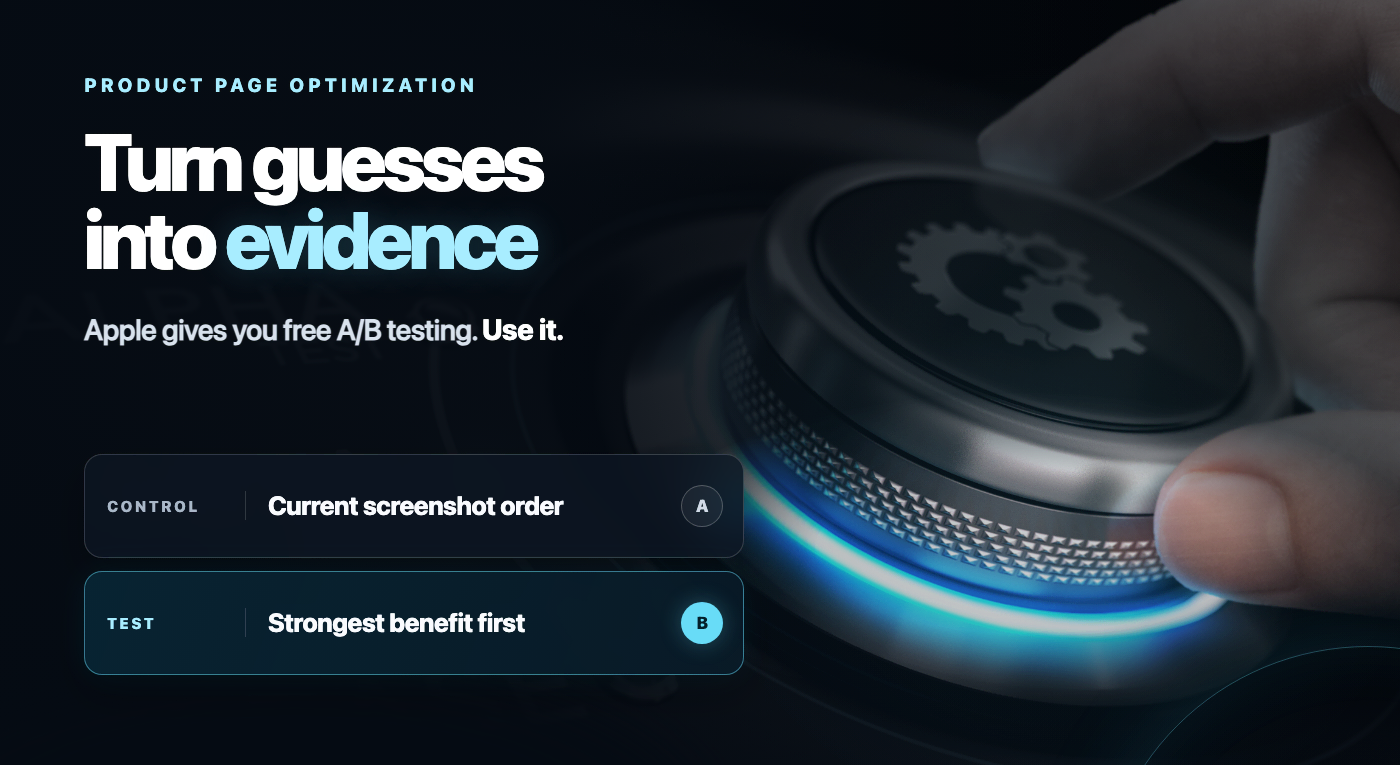
Apple gives you free A/B testing – product page optimization in App Store Connect – that runs your current page against up to three treatments. Most developers have never run a single test, which means every screenshot decision they’ve ever made is a guess that was never checked. I’m not judging: it’s all guesswork, mine included – the difference is that a well-run test gives you evidence about the guess.
The quick check: Open Apple’s product page optimization guidance and estimate whether your traffic and expected effect can produce a useful result. There is no universal “thousands of impressions” threshold: confidence depends on the traffic, baseline conversion, allocation, and size of the real difference. If traffic is small, test one bold hypothesis rather than several subtle ones.
Stop reading, start doing
- Count the characters in your name and subtitle – if either is under 30, fill it with keywords now.
- Dedupe your keywords across all three fields, and clean the spaces and filler out of the keyword field.
- Put a readable benefit caption on your first screenshot, test it at real search-result size, and move your best three to the front.
- Add
requestReview()at your app’s happy moment, then reply to your three worst recent reviews.
Fix what you can now, list what needs a new version or review, and give every larger change some sort of measurement plan.