
App Store competitor analysis: how to spy on your rivals (ethically)
Version histories, paywall flows, ad libraries, metadata snapshots – your competitors publish their entire strategy in public. Here’s how to read it.

Competitor analysis doesn’t require secret access, because your rivals publish most of what you need themselves: App Store listings, version histories, reviews, pricing, onboarding flows, and even their advertising campaigns. Individually these might not say much, but when put together they can reveal product priorities, marketing strategy, and opportunities the market is still missing.
That’s what this post is going to provide: the full competitor recon stack, all broken down and ready for you to try:
- Start where your users start
- “What’s New” archaeology
- Metadata snapshots
- Read the four-star reviews
- Capture their paywalls
- The Ad Library
- Turning recon into decisions
- Two red flags
I know some folks don’t like the idea of spying on competitors, so I want to be clear on what I mean by “ethically.” Everything below uses information your competitors chose to publish: store listings, release notes, adverts, prices, and more. So, keep to public information, obey all relevant terms and rate limits, don’t circumvent authentication or try to impersonate customers, and don’t copy protected creative.
Apple’s App Review Guidelines are equally clear about copycats and manipulated discovery. Reading published material isn’t spying, really; it’s just doing your homework. (But “How to do your App Store homework” is a much worse title, so here we are…)
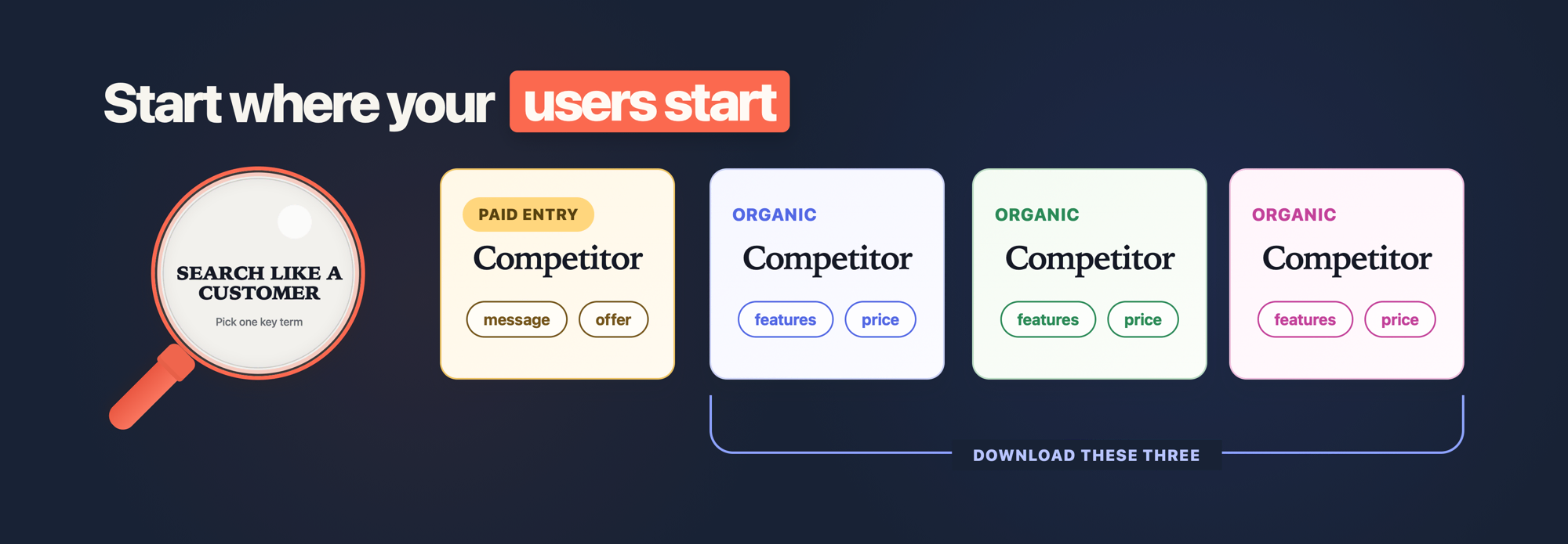
Start where your users start
Try to put yourself in your users’ shoes: go to the App Store on your phone, type in roughly what they would type to find your app, and see what comes back from the search. Look at the organic results, yes, but also the sponsored ones, because a sponsored placement proves that an advertiser considered the market valuable enough to enter that auction.
From there the formula is simple:
- Start with your three most prominent competitors who are serving the same customer and job. Expand this only if the first three leave some important questions unanswered.
- Look at the features they offer, and how they talk about those features both in the app and in their metadata.
- Look at their pricing models, and which monetization option they are pushing you towards.
Then ask yourself: if your app didn’t exist, which of these would you choose? You might have one answer for design, another for features, another for pricing – and that’s fine, because each answer tells you something about where the bar actually sits.
Here’s your first bit of homework, and I mean right now: pick your single most important search term, type it into the App Store on a real device, and download three direct alternatives.
Go on – I’ll wait.
“What’s New” archaeology
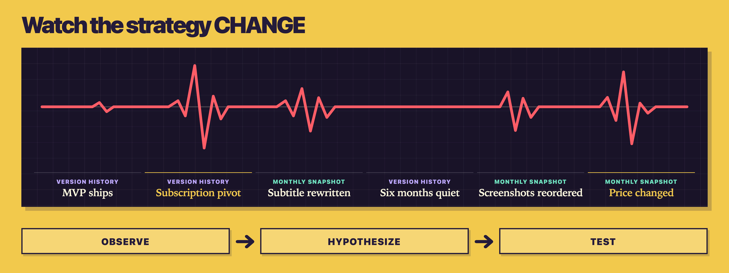
This is my favorite technique in the whole stack, because so few people use it. Every app’s product page has a Version History page, and it shows the “What’s New” text for their 25 most recent releases – what shipped, and when.
If you read their changelog from bottom to top (oldest to newest), you’re effectively watching their strategy unfold in slow motion: what they prioritized, what they abandoned, when they pivoted to subscriptions, and when they suddenly went quiet for six months. For younger apps these notes might even reach back to version 1.0, so you can see exactly what made it into their MVP and what didn’t – which itself is a fantastic sanity check on the scope of your first release.
While you’re there, take note of how much time has passed since they shipped their last update, and roughly how often they ship. That tells you about visible release cadence, not team health or market strength – a 14-month-old release may indicate neglect, deliberate stability, or substantial work happening elsewhere; use reviews and hands-on testing to distinguish them.
Metadata snapshots
Every app’s name, subtitle, description, screenshots, and price are the result of all the ASO decisions that developer has made – and when they change, that’s a decision too. The problem is your memory: three months from now you won’t remember what their subtitle used to say, so you can’t see what they changed or guess why.
The fix is boring and effective: take monthly snapshots for each competitor, saved into a dated folder. Aim to store the following:
- A full screenshot of their product page.
- Their name, subtitle, and the first few lines of their description, as text.
- Their screenshots, in order.
- Their price and in-app purchases.
That’s maybe ten minutes of work each month, and the diffs help lead to a range of questions worth asking:
- Reordered screenshots might be them adapting to product page optimization tests.
- Price changes might reflect confidence, new costs, a changed audience, or something else entirely.
- A lack of any visible changes might mean they have refreshed the app’s keywords.
For every change, write three lines: what you observed, your best hypothesis, and the cheapest test that would help you decide whether you should respond.
There are plenty of services that will do parts of this watching for you – Appfigures and Sensor Tower are common choices. My own Kickstart app privately tracks competitors right on your Mac: it pulls their metadata, reviews, release cadence, and pricing into one comparison table, and even tries to reverse-engineer which keywords they’re targeting from their title, subtitle, and screenshots. (But the dated-folder habit costs nothing and teaches you more than any dashboard, so start there!)
Read the four-star reviews
When you’re looking for weak spots, reading negative reviews is the obvious play – those people discovered the app, tried it, and found it didn’t fit into their life. Why not? And, more importantly, will your app hit the same wall?
But the interesting move is the four-star reviews. These are people who liked enough of the app to rate it highly, while still taking the time to name one or more problems with it. That doesn’t mean they would switch to your alternative, but their comments might reveal friction worth checking across dates, versions, countries, and other reviews.
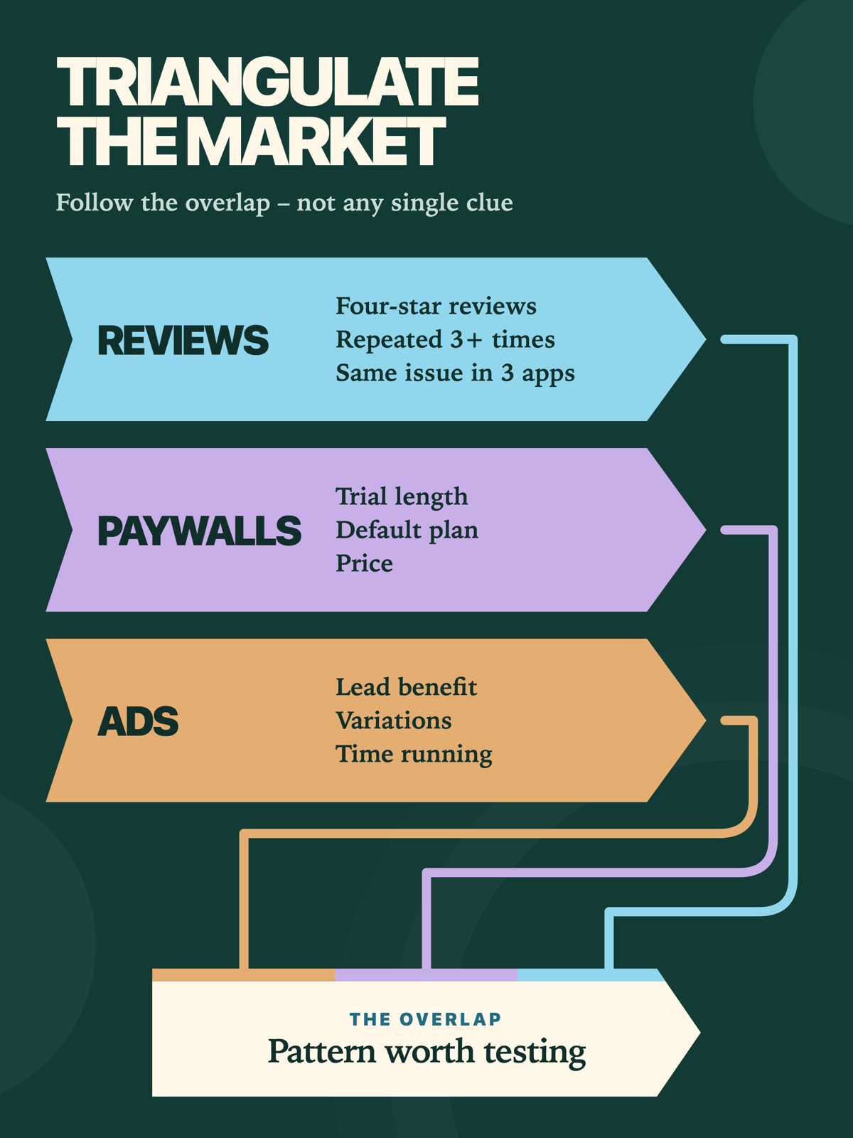
So, sort the reviews by most critical, read 20–30 per competitor, and write down every complaint that appears more than twice. If three different apps in your niche are all getting hammered for the same thing, then congratulations: you’ve found a gap the whole market is leaving open.
Capture their paywalls
You already know how each of your competitors works because you downloaded them all earlier. Now go back through them again, slower, screenshotting every step of onboarding and every paywall: the headline, the number of plans, which plan is pre-selected, the trial length, and where the close button is hiding.
 Tap for full-size (opens in a new tab)
If you want, you can scroll to the bottom of their App Store product page and expand the In-App Purchases list. But much more revealing is to take out a free subscription yourself, then go to your App Store account’s subscriptions page for that app – it will show you all the alternatives available in that tier, so you can see whether they have kept older plans active at different price levels.
If you want to see how the wider market handles paywalls, Paywall Screens listed 10,235 real examples when I checked on 5th August, 2026, and PaywallPro does something similar with a subscription-intelligence slant. The count will keep moving, but your direct competitors’ paywalls matter far more than the global gallery because they’re priced for your users.
I’ll admit this is the layer I resisted longest. Sitting there screenshotting someone else’s free-trial screen felt faintly ridiculous – right up until I noticed every serious competitor in a niche had converged on the same trial length, which is not a coincidence, and not something I would ever have spotted from theory.
The Ad Library
You know how these apps work, so now your job is to find out how they want to be seen. One thing Meta does genuinely well is transparency about adverts: go to the Meta Ad Library – it’s public, with no account needed – set the country, and search for your competitor’s page.
You’ll see every advert they’re currently running across Facebook, Instagram, and the rest of Meta’s platforms, including creative, when it started, the audience it’s targeting, and whether it’s still active.
Now try to approach the results as if you were a marketing strategist. Think about things like:
- Which benefits do their adverts focus on? (Note: This shows only the message they chose to test, not proof that it converts.)
- How many variations of one ad are running? Are they using Facebook’s automatic ad variation creator? Lots of variations means active testing; one lonely ad means autopilot.
- How long has the oldest ad been running? A long-running advert is worth studying, but only the advertiser knows whether it has a positive return.
TikTok and Instagram give you the influencer-focused version of the same signal: every time I see a suspiciously glowing video about an app where the description says it’s a paid promo, I’m delighted – now I can see exactly what the developer chose to promote, and precisely who they’re aiming it at.
Turning recon into decisions
A folder full of screenshots isn’t a strategy, so let’s go through what you’ve gathered.
For each competitor, write a SWOT chart – list their Strengths, Weaknesses, Opportunities they present for you to win, and Threats they pose against you. That will produce four short lists per competitor, each one taking only a few minutes to do, and, if you’re doing it right, should also force a healthy dose of extra honesty into your thinking.
But there are two principles I suggest you apply while you write them.
The first is called Chesterton’s Fence: if you find a feature that makes you think “what the heck is that for?”, resist the instinct to say “I’d never do that.” These apps are, by definition, doing well enough to be found, so figure out why the fence was built before you plan an app without one. Is it a good feature that was just executed badly, a niche feature that was surfaced too widely, or something else?
And the second is about their tutorials and onboarding flows – these can either show features the app developer really wants to thrust under the user’s nose, or where they expect users to need extra help. That might signal avoidable complexity, or it might be a sensible explanation for a genuinely advanced workflow. Check the same topic in the user reviews before deciding which.
When I asked Ryan Jones from Flighty about his approach, he put it perfectly:
“My dream was to remove the user complexity by doing everything automatically behind the scenes.”
Almost all users care about your competitor’s app far less than its developer does. If a feature needs explaining, someone will eventually abstract that complexity away and collect the credit – so let it be you.
It might sound strange, but pay attention how each of the apps make you feel as you fill in those SWOT lists. Years ago I got to spend a few weeks working with Kathy Sierra – creator of O’Reilly’s Head First series, and a longtime hero of mine – and one of the many smart things she said was that if people love your idea, that’s good, and if people hate it, that’s also good. The only real problem is “meh.”
So: which competitors made you feel something, and which made you feel nothing at all? The strong reactions – both directions – are where your positioning lives.
Whatever you find, don’t aim to be better at everything, because that’s a mammoth effort and it’s unlikely to work. Aim to be the best at something, and let the SWOT lists tell you which something is undefended.
Two red flags
Sometimes you might encounter two situations that should give you pause.
First, zero competition. Did you search thoroughly and find no competitors at all? You might genuinely have an original idea, in which case great! But sometimes competition means no market, so be careful.
The exception is a new platform or technology wave, where the space hasn’t filled in yet. I asked Devin Davies why he was keen to ship Crouton on Vision Pro launch day, and here’s what he said:
“I figured that as it’s a new platform there is a chance to get in early and establish yourself as a key player. When I came into iOS development there was already a plethora of recipe apps, so I thought if I could be on the Vision Pro day one and grow from there, then hopefully when the platform matures there was a chance Crouton is a household name on Vision Pro.”
The Wall Street Journal featured Crouton for exactly that reason, and the app did so well he ended up being acquired.
Second, the “this sucks” heavyweight. If you found a dominant app and thought “who would ever want this?”, you’ve missed the setup: they’re already dominant. Their UI might be dull and their ASO five years stale, but they have the market position you’re dreaming of – I expect you’d trade your cunning twist for their install base in a heartbeat. Dull-but-established isn’t a weakness to mock; it’s the fence from earlier, and you need to understand it before you plan around it.
You can’t disrupt what you don’t understand. So, study the battlefield first, then choose where to strike.
Stop reading, start doing
- Search your main term on a real device and download three direct alternatives, noting sponsored results separately.
- Read the Version History for your three biggest competitors, oldest entry first, and note their release cadence.
- Create a dated snapshot folder and capture each competitor’s product page, metadata, screenshots, and paywall today.
- Look each one up in Meta’s Ad Library, then write down the one benefit their ads lead with.
Do that this week and you’ll have evidence you can use, rather than a folder of confident guesses.