
How to make an app press kit journalists actually open
The exact anatomy of a press kit that gets your app covered – the fact sheet, the images journalists use, and a complete template to copy.

Your app’s press kit has only one job, which is to make it as effortless as possible for someone to write about your app. Sadly, most manage to fail this job because folks assume journalists are reading press kits from top to bottom, when the reality is that they are scanning them while juggling dozens of other pitches, looking for screenshots, pricing, links, and a clear explanation of why they should care. (You know why your app is unique and special, but they’ve never heard of it and are coming at the concept fresh – you can’t be clear enough!)
I spent eight years as a full-time tech journalist, and I saw the same basic mistakes over and over again: missing prices, missing screenshots, and (worst of all) long-winded marketing copy instead of facts. Every unnecessary hurdle made it less likely a launch would be covered, and the frustrating part is how easy it is for anyone to do better.
The truth is really simple: if you spend just one afternoon assembling a proper press kit following my instructions below, you’ll already be ahead of most indie developers.
This guide shows you exactly how to do just that. It’s a long guide, so here’s where we’re going:
- What a press kit actually is
- Where your press kit should live
- The fact sheet: seven boring facts
- Images that actually get used
- The words: three descriptions, not one
- Proof you’re real: bio, coverage, contact
- A free template you can use
- Mistakes that go straight in the trash
What a press kit actually is
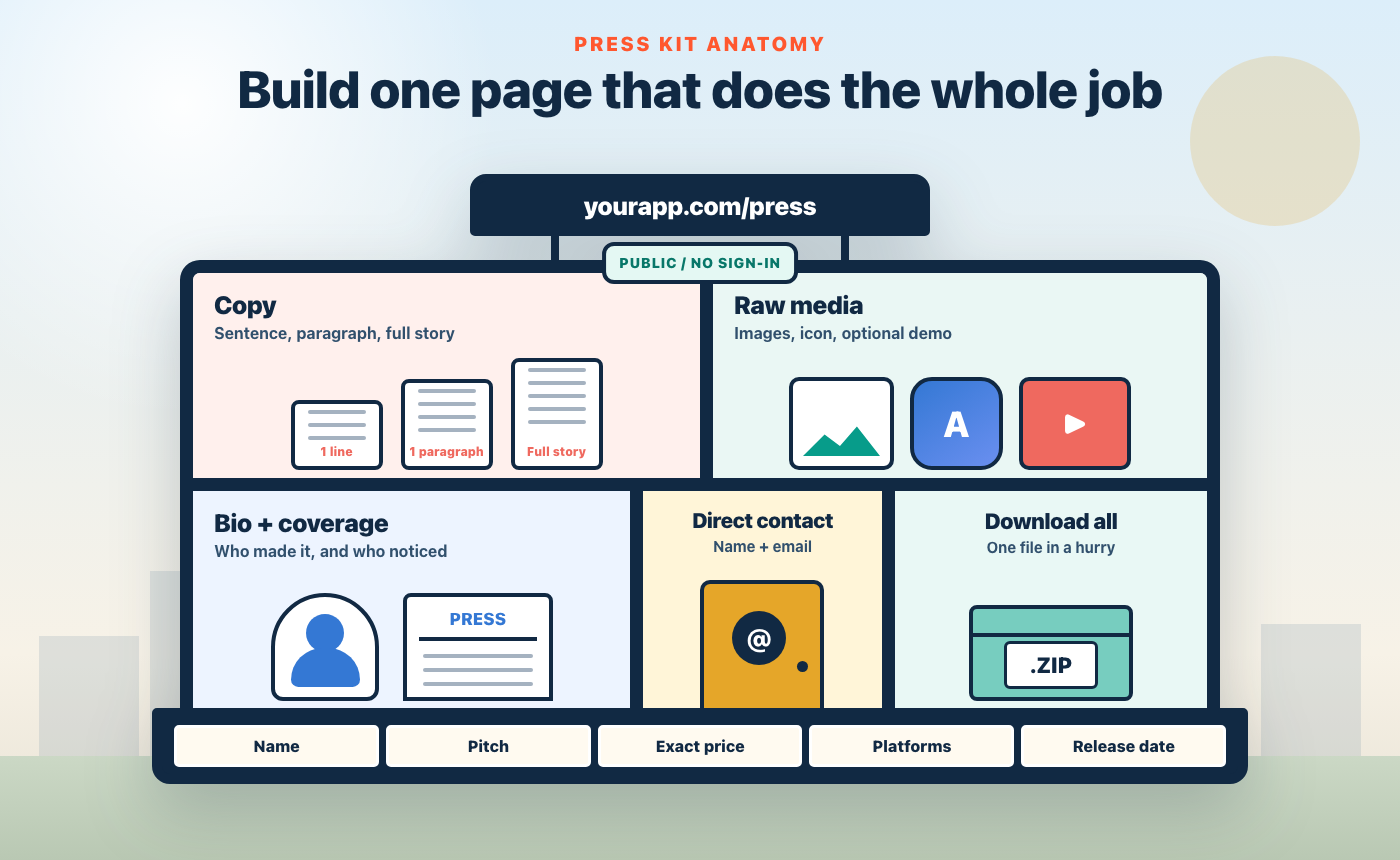
A press kit is ideally a single page on your app’s website, usually hosted at yourapp.com/press, designed to give writers everything they need to cover your app without emailing you a single question.
To be clear, that’s the whole job of your press kit: remove every excuse not to write about you.
Everything below walks through each of the pieces one at a time, because the difference between a kit that gets used and one that gets ignored is entirely in the details.
That means the resolution of the screenshots, the length of the descriptions, and – gasp! – whether the price is actually written plainly somewhere on the page. (I know that sounds obvious, but trust me: so many people miss these fundamental things.)
Where your press kit should live
Put it on your own domain, at /press. Not a Google Drive folder, not a Dropbox link, not an email attachment – a plain web page anyone can reach without signing in, forever.
Why is this so strict? Because writers work on deadlines, and every barrier you create costs you coverage. A Google Drive link that needs permission is a dead end at 11pm, and I can’t begin to tell you how many people made this exact mistake. A 40MB email attachment is a file-management chore, and might even get bounced from their inbox. A Notion page is acceptable at a push, but a page on your own site also quietly proves the app has a real home, and also gives you complete control over its design.
While researching this, I want to share advice I got from John Voorhees, managing editor of MacStories – someone who has spent over a decade deciding which apps get covered, and co-hosts the AppStories podcast, which has called out new and interesting apps every week for more than 450 episodes. I asked John straight up what raises the odds of coverage on MacStories, and here’s part of what he said:
“A separate press kit means not having to attach a bunch of screenshots and other files to the email, which turns your pitch into a file management exercise for the recipient. Instead, include all those assets alongside a detailed breakdown of your app on a simple webpage that can serve as your press kit.”
He also pointed me at presskit(), the free, open-source template the indie video game industry has used for years – it was created by Rami Ismail of Vlambeer, and it strikes a nice balance between comprehensive and readable.
For app-specific hosted options there’s also Filip Němeček’s ImpressKit, which builds and hosts the page for you for a small yearly fee, and there’s also my own app, Kickstart, which can create your press kit and website for you automatically. Any of these beats having nothing, but a page on your own site beats all of them.
Important: Whatever you use, the URL must work before you send a single pitch, and it must never move. Journalists often bookmark these pages and come back at some point later – a 404 six months later costs you the follow-up article too.
The fact sheet: seven boring facts
The top of your press kit should be a simple table of plain facts about your app. That means no fancy adjectives and no “mission statement”, but just the core facts about what you’ve built:
- App name – exactly as it appears on the App Store.
- One-sentence pitch – what it does and for whom, in plain language.
- Price – the real numbers: “Free, with a $9.99/year subscription for advanced features.” Not “freemium,” not “see store page.” (If you’re using purchase power parity, it’s okay to say that prices will vary around the world.)
- Platforms and requirements – “iPhone and iPad, iOS 26 or later.”
- Release date – or the planned launch date if you’re pre-launch.
- Developer – your name or company name, and where you’re based.
- Link – the App Store URL, or TestFlight if you haven’t launched yet.
That pricing line matters more than you’d think. When I was reviewing products, vague pricing was one of the most common reasons a piece stalled – I wasn’t going to write “costs money, probably” and I didn’t have time to install some software and track down the paywall to check whether it was worth covering. So, write your numbers down. If your pricing is complicated, that’s worth knowing too – simplifying it is a whole other post.
Do this now: open some of your favorite indie apps’ websites and look for their press page – you’ll find most don’t have one at all, which tells you both how low the bar is and how easy it is to clear.
(If you’re curious, here’s the press page for Kickstart).
Images that actually get used
Here’s the counterintuitive part: the screenshots journalists want are not your App Store screenshots.
Your store screenshots have marketing frames, captions, and giant “Track everything!” text – they’re adverts, basically. A publication can’t run adverts as editorial images, so if those screenshots are all you provide someone has to install your app and take their own screenshots… or, far more likely, cover a different app instead.
What you should provide:
- 6–12 raw screenshots – actual screens of your app doing its job, exported at full device resolution as PNGs. No frames, no captions, no watermarks.
- Realistic demo data – nobody wants to publish a screenshot of “Test item 1.” Fill the app with plausible, slightly interesting content before you capture, showing what real users will see.
- Your app icon at 1024×1024 – the size you already made for App Store Connect, plus your logo if you have one. Writers use icons constantly, and hunting for a clean copy is miserable; a few smaller sizes (512, 256) are a kind bonus. (Bonus points if you have a logo that’s an SVG.)
- Light and dark mode where your app looks good in both.
- Optional extras: A short screen recording or a couple of GIFs showing your app’s single best interaction.
Make every image individually viewable on the page and bundled into one zip download. Some writers grab one image and others grab everything then sift through it later, so serve both.
Capturing all this is genuinely tedious by hand, which is exactly why tools exist for it – the Simulator’s Cmd+S saves clean full-resolution PNGs, and xcrun simctl io booted recordVideo demo.mp4 records the screen. Kickstart handles the assembly end of this: you fill in the facts and images, and its press kit creator exports the whole thing as a ready-to-upload zip – resized icons, images, a PDF press release, even a QR code to your App Store page – and its website builder can generate the /press page itself. It won’t take the screenshots for you or send the emails, though; that part is still on you!
The words: three descriptions, not one
Writers quote, paraphrase, and compress, so give them your app in three sizes:
- One sentence. The elevator pitch: “Habitual is a habit tracker that ditches the clutter and leans on proven psychology like habit stacking, streaks, and Atomic Habits-style starts.” This is the line that is most likely to be quoted verbatim by writers, so make it a line you want to be quoted.
- One paragraph. The sentence plus who it’s for, what makes it different, and the price.
- The full story. The problem, your approach, and the three or four features that genuinely distinguish it, in a few short paragraphs. Not your entire App Store description – that’s sales copy, and this is reference material.
Then a bulleted list of key features, each one a plain sentence that stands alone: “Habitual is designed to be so lightweight that sticking with it feels effortless.” Bullets get lifted straight into articles, so write each one as if it will be – because it will.
Important: Resist your marketing voice everywhere here.
Seriously, you aren’t trying to sell the app the way your App Store description does – and when I was the one reading pitches, anything vague or confusing got ignored, because if the immediate value wasn’t clear I moved on. So, be clear and specific, and let journalists make up their own mind.
Proof you’re real: bio, coverage, contact
Three short sections finish the kit, and each one answers a question the writer is silently asking.
“Who made this?” A two-or-three sentence bio: who you are, where you’re based, what you’ve shipped before, and – if it helps the story – why you built this app. Indie stories are an angle in themselves; “solo developer builds the flight tracker airlines wish they had” is a better headline than anything about features. A photo of you is optional but useful for profile pieces.
“Does anyone else rate it?” If you have press coverage, link the two or three best pieces with publication names. If you have a lovely user review or a TestFlight quote, include one or two. If you have neither because you haven’t launched yet – skip the section entirely. An empty “as seen in…” is worse than nothing.
“Who do I ask when I need something at 9pm?” A real name and a real email address, at the top of the page and the bottom. Not a contact form – forms are where follow-up questions go to die. When a journalist emails the night before publishing to ask “what’s the Android situation?”, the speed of your answer can decide whether the piece runs.
The free template
Here’s the whole thing, ready to copy. Replace the brackets, delete what doesn’t apply, and put it at yourapp.com/press:
# [App Name] press kit

**Contact:** [Your Name] – [you@yourapp.com]


## Fact sheet

- **App:** [App Name]
- **What it is:** [One-sentence pitch – what it does, for whom.]
- **Price:** [Free / $X one-time / Free with $X/year subscription for …]
- **Platforms:** [iPhone, iPad, Mac – minimum OS version]
- **Release date:** [Month Day, Year – or “Launching Month Year”]
- **Developer:** [Your name / company], based in [place]
- **App Store:** [URL]
- **Website:** [URL]


## About [App Name]

[One paragraph: the pitch, who it’s for, what makes it different,
and the price.]

[The full story: the problem, your approach, and the three or four
features that genuinely set it apart, in a few short paragraphs.]


## Key features

- [Feature as a plain standalone sentence.]
- [Feature as a plain standalone sentence.]
- [Three to six of these.]


## Images

[6–12 raw screenshots at full resolution, viewable here.]
[App icon: 1024, 512, 256.]

**[Download everything as a zip](your link here)**


## About the developer

[2–3 sentences: who you are, where you’re based, what you’ve shipped
before, why you built this.]


## Coverage

- “[Short quote.]” – [Writer], *[Publication]* ([link])


## Contact

[Your Name] – [you@yourapp.com]
[Mastodon / Bluesky / X handle]
That looks deliberately boring, but that’s the point: your press kit is a reference document, not a landing page. Your landing page persuades; your press kit serves.
Mistakes that go straight in the trash
I told you I spent eight years reading pitches, so let me save you from the failures I saw weekly:
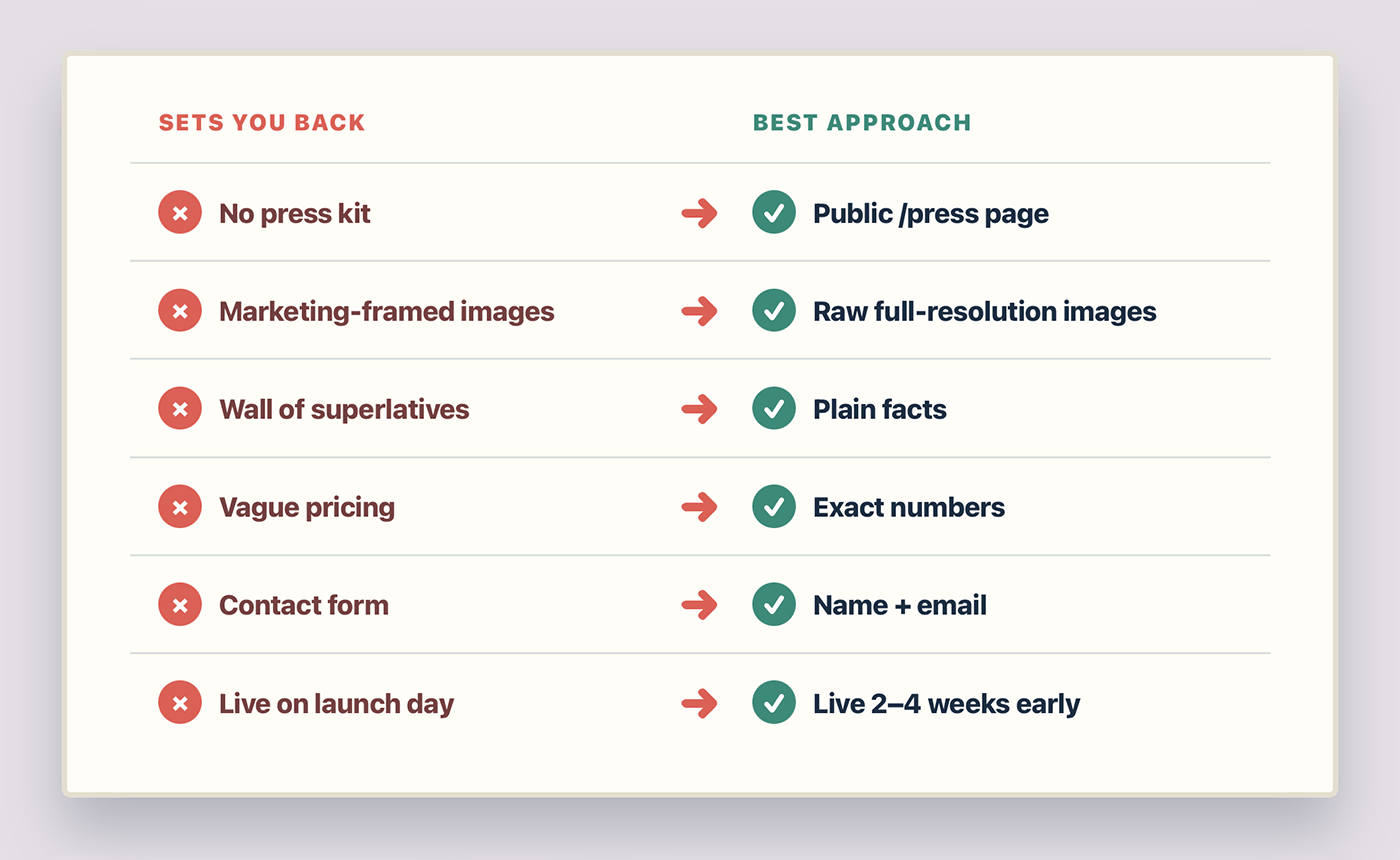
- No press kit at all – making the writer scrabble around your marketing site for artwork and a price. Most coverage dies right here.
- Screenshots inside marketing frames – unusable as editorial images, as covered above.
- A wall of superlatives with no facts – if the immediate value isn’t clear, they move on. Nobody has the time or patience to decode what “reimagining productivity” actually means.
- Missing or vague pricing – the single most common gap I saw.
- A contact form instead of an email address – or worse, no contact at all.
- A press kit that appears on launch day – reach out before release. Some smaller outlets can move quickly and breaking news changes schedules, but most writers won’t drop planned work because your app shipped today.
None of these mistakes mean your app is bad. They just mean the writer couldn’t see whether it was good in the few seconds they had, and if someone else’s app makes it easier then they are more likely to get coverage.
Stop reading, start doing
- Create the /press page on your app’s site today – paste in the template above, even half-filled. An incomplete press kit beats a missing one.
- Write your fact sheet: name, one-sentence pitch, price, platforms, release date, contact. Fifteen minutes.
- Fill your app with realistic demo data and capture 6–12 clean, unframed screenshots at full resolution.
- Zip everything and put the download link at the top of the page.
John Voorhees’s advice shaped a lot of what you’ve just read, and the other half of his answer was about the pitch email itself – short, tailored, focused on what makes your app unique. We’ll pick that part up in a future post, because a great press kit deserves a pitch that actually gets it opened.